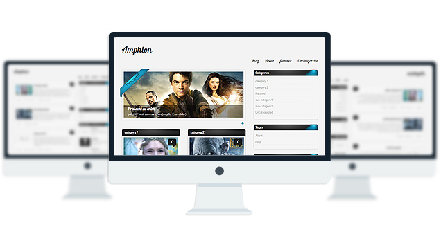
Amphion LiteFree WordPress Theme

- Unique Homepage With Slider.
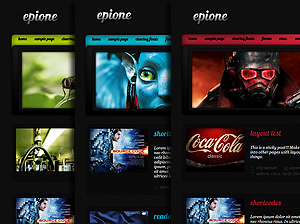
- 2 fantastic skins.
- 2 custom widgets.
- 2 easy to use shortcodes.
- 2 WordPress 3.0 Menus.
- Mult-Level Dropdown Menu.
- Social buttons to submit posts to Facebook, Twitter,
- Stumble upon, Digg, Google Buzz!
- Awesome fonts.
- Easy to use theme options.
- Gravatar Support.
- 3 custom page template
- Fancy lightbox
- IE6 Browser Upgrade Alert!
- Separation of Comments and Trackbacks
- Threaded comments support.
- Valid XHTML/CSS3.
- Well-written documentation
- No hidden, paid or sponsored links in the theme.
- One Click Install. No plugin required.
Compatibility:
- Internet Explorer 7+
- Firefox 3+
- Safari 5
- Opera 9+
- Netscape 6+
version 1.8
—————-
+ Slider item was disappearing when the slider category name had 2 words.(fixed)
+ Blocks disappearing issue solved.(fixed)
+ Featured Image support for all posts.(fixed)
+ Fancybox images were stretched in Chrome and Safari.(fixed)
+ Some Minor CSS fix.
version 1.7
—————-
+ Initial Release
1. How do I make the text of the site darker?
Go to Appearance> Editor and select “Stylesheet” from right and add this line to the very bottom:
#sidebar .widgets ul li a, #single_posts .post_mid, #sidebar .widgets, #sidebar .widgets, #latest_posts .post_mid, #latest_posts .post_meta a, #latest_posts_full .post_mid, #latest_posts_full .post_meta a, #single_posts .post_meta a, .amp_page, .amp_next, .amp_prev, .footage ul li, .footage ul li a, .copy_content, .copy_content a, #footmenu, #footmenu ul li a, #comment, #single_posts #related a{color:#333!important;}
2. Where is the Summary Field of the slider? Why don’t I see it?
A: In wordpress 3.1 the custom field option is disabled on default. To enable the custom field feature go to Posts > Add New . In the post editor page at the very top click on the “Screen Options” button. Now make sure “Custom Field” option is checked.
Check this screenshot: http://www.freeimagehosting.net/uploads/56c4da97be.png
3. The images inside the lightbox is being stretched when viewed by Safari Browser, How do I fix this?
A: Add this line to the very bottom of your stylesheet(style.css):
#fancybox-img {height:auto!important;}
- erikehasoo.donnybrook.ee
The theme is released under GNU General Public License, version 2.
| Amphion Lite | Amphion PRO | |
| Free For Life |
$30 One time payment |
|
| Skins | 2 | 7 |
| Fonts | 2 | 10 |
| Slider | 1 | 3 |
| Shortcodes | 2 | 5 |
| Widgets | 3 | 8 |
| Widget Areas | Sidebar Widgets/ Footer Widgets | Sidebar Widgets/ Footer Widgets |
| Menu | 2 Menu Positions/ 3 Level Drop-down Menu | 2 Menu Positions/ 3 Level Drop-down Menu |
| Page Templates | 3 | 3 |
| Upload LOGO |
NO |
YES |
| Social Share buttons/Numbered Page Navigation |
YES |
YES |
| Related Posts |
NO |
YES |
| Threaded comments |
YES |
YES |
| IE6/ IE7 Browser Upgrade Alert! |
NO |
YES |
| Fancy lightbox |
YES |
YES |
| Full Email support |
NO |
YES |
| Forum support |
NO |
YES |
-
- Topic
- Voices
- Freshness
You must be logged in to create new topics.


thanks for tips but still 2 of my menus (CSDAA Board and Necrology) looks imperfect… how to fix it?
and for 4 blocks of category (top name in black area) still don’t match the links… HELP!
I love this theme! Can you confirm that if I update to WordPress 3.1.2 that everything will still display correctly in my theme?
Thanks!
What problems are you having?
How do i remove the comment boxes?
I am very happy with the theme too
Go to Appearance> Editor and select “stylesheet” from right and add this line at the very bottom of the editor:
#single_posts .comments, .block_comm .comments, #latest_posts .comments{display:none!important;}
Is there any way I can get rid of the fancy box that comes with this theme?
nevermind. I saw the post above..
thanks for tips but still 2 of my menus (CSDAA Board and Necrology) looks imperfect… how to fix it?
and for 4 blocks of category (top name in black area) still don’t match the links… HELP!
Go to Appearance> Editor and select stylesheet from right and find this line:
#topmenu ul li ul li a span {background: url(“images/buttonbg.png”) repeat-x;border: 1px solid #15C9E3;color: #FFFFFF;cursor: pointer;display: block;height: 15px; margin-left: 3px;width: 120px;}
and remove the border: 1px solid #15C9E3; from this line.
about the submenu of “Necrology”try to keep you sub-menu text small… Go to Appearance> Menus and setup the menu…
and the 4 blocks category link may be conflicting with the membership plugin that you installed..
im still struggling with blocks of category thing. i dont unds why it keeps linking to members area only. i am no pro with website but just give me some suggestions on how to fix it.
i wondered why are there 2 links in one block?
rephrase here… i want top link for category list i set up and bottom link is fine…